Mo Pop Music Festival
An expressive, type-driven poster series and type-in-motion animations for Detroit’s Mo Pop Festival.

details
the brief
Mo Pop Festival is a three-day music event at Hart Plaza in Detroit, August 1 to 3, 2025, with indie, pop, hip-hop, electronic, and R&B artists. The brief: an expressive, type-driven poster series for an 18 to 34 audience that loves discovering new music and supports local Detroit artists.
the approach
Five words guided the work: bold, immersive, communal, rhythmic, and dynamic. After testing dozens of typefaces, I paired Zuume for headlines with Paralucent for supporting text, and built a palette of hot pink, yellow-green, near-black, and cream. The main challenge was hierarchy: making the title stand out without overwhelming the layout, so I tested lockups, spacing, and color across all three posters.
the result
A three-poster series and type-in-motion animations that use bright, bold color and simple sans-serif type to carry the festival’s energy while staying easy to read. The project taught me to simplify, removing elements that crowded the design, and to organize layouts with a lot of text.
Mo Pop Music Festival
An expressive, type-driven poster series and type-in-motion animations for Detroit’s Mo Pop Festival.
details
the brief
Mo Pop Festival is a three-day music event at Hart Plaza in Detroit, August 1 to 3, 2025, with indie, pop, hip-hop, electronic, and R&B artists. The brief: an expressive, type-driven poster series for an 18 to 34 audience that loves discovering new music and supports local Detroit artists.
the approach
Five words guided the work: bold, immersive, communal, rhythmic, and dynamic. After testing dozens of typefaces, I paired Zuume for headlines with Paralucent for supporting text, and built a palette of hot pink, yellow-green, near-black, and cream. The main challenge was hierarchy: making the title stand out without overwhelming the layout, so I tested lockups, spacing, and color across all three posters.
the result
A three-poster series and type-in-motion animations that use bright, bold color and simple sans-serif type to carry the festival’s energy while staying easy to read. The project taught me to simplify, removing elements that crowded the design, and to organize layouts with a lot of text.
Mo Pop Music Festival
An expressive, type-driven poster series and type-in-motion animations for Detroit’s Mo Pop Festival.
details
the brief
Mo Pop Festival is a three-day music event at Hart Plaza in Detroit, August 1 to 3, 2025, with indie, pop, hip-hop, electronic, and R&B artists. The brief: an expressive, type-driven poster series for an 18 to 34 audience that loves discovering new music and supports local Detroit artists.
the approach
Five words guided the work: bold, immersive, communal, rhythmic, and dynamic. After testing dozens of typefaces, I paired Zuume for headlines with Paralucent for supporting text, and built a palette of hot pink, yellow-green, near-black, and cream. The main challenge was hierarchy: making the title stand out without overwhelming the layout, so I tested lockups, spacing, and color across all three posters.
the result
A three-poster series and type-in-motion animations that use bright, bold color and simple sans-serif type to carry the festival’s energy while staying easy to read. The project taught me to simplify, removing elements that crowded the design, and to organize layouts with a lot of text.
project gallery
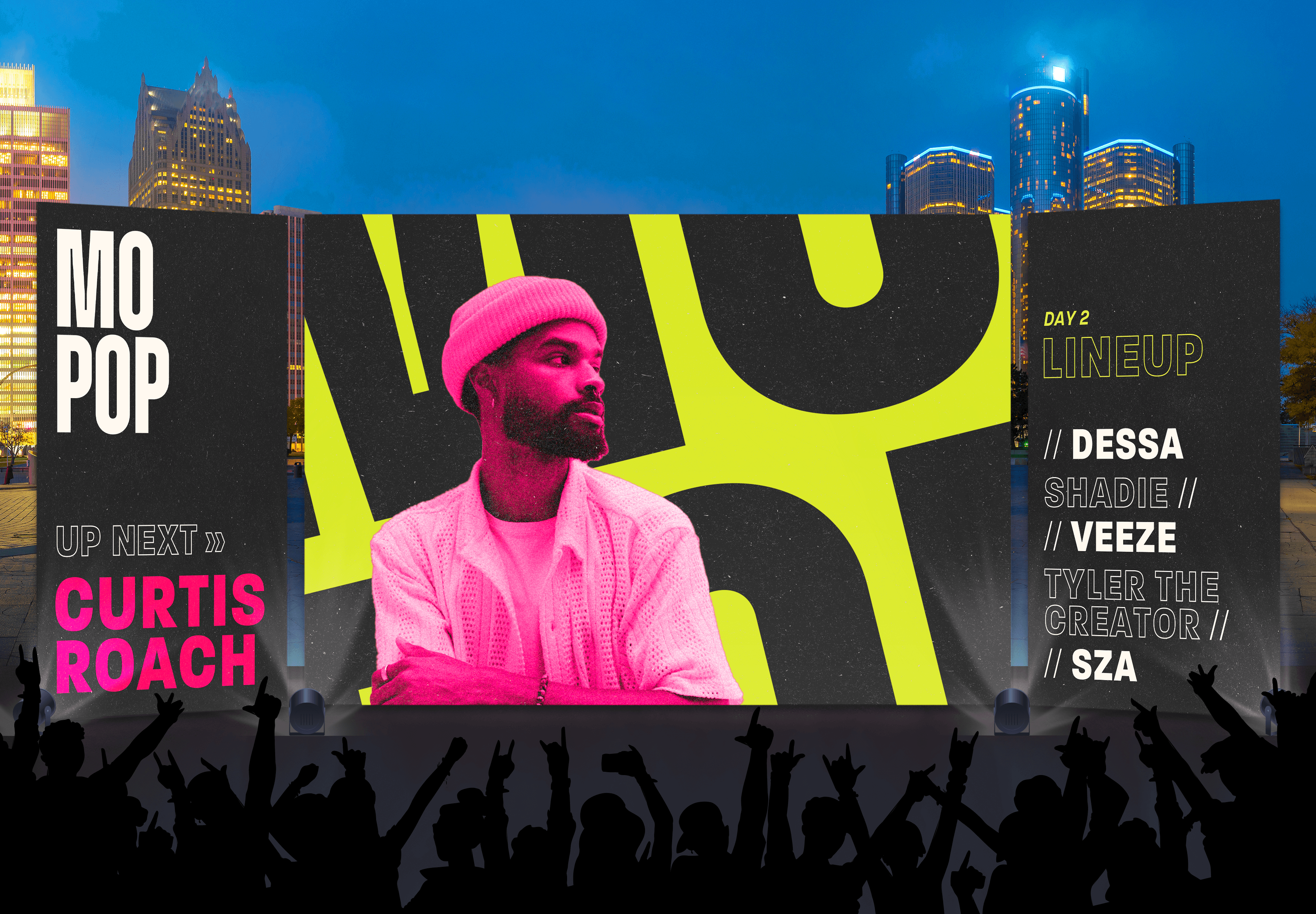
The identity extends to the stage.

Day one: bold type and high contrast.

Day two: a complementary colorway.
Another view of the day-one poster.
